A student-led design project focusing on creating a COVID-19 vaccination booking app for the Ontario government.
Role: UX Designer, UX Researcher
Tools: Miro, Figma, iMovie
Timeline: 12 Weeks
Overview
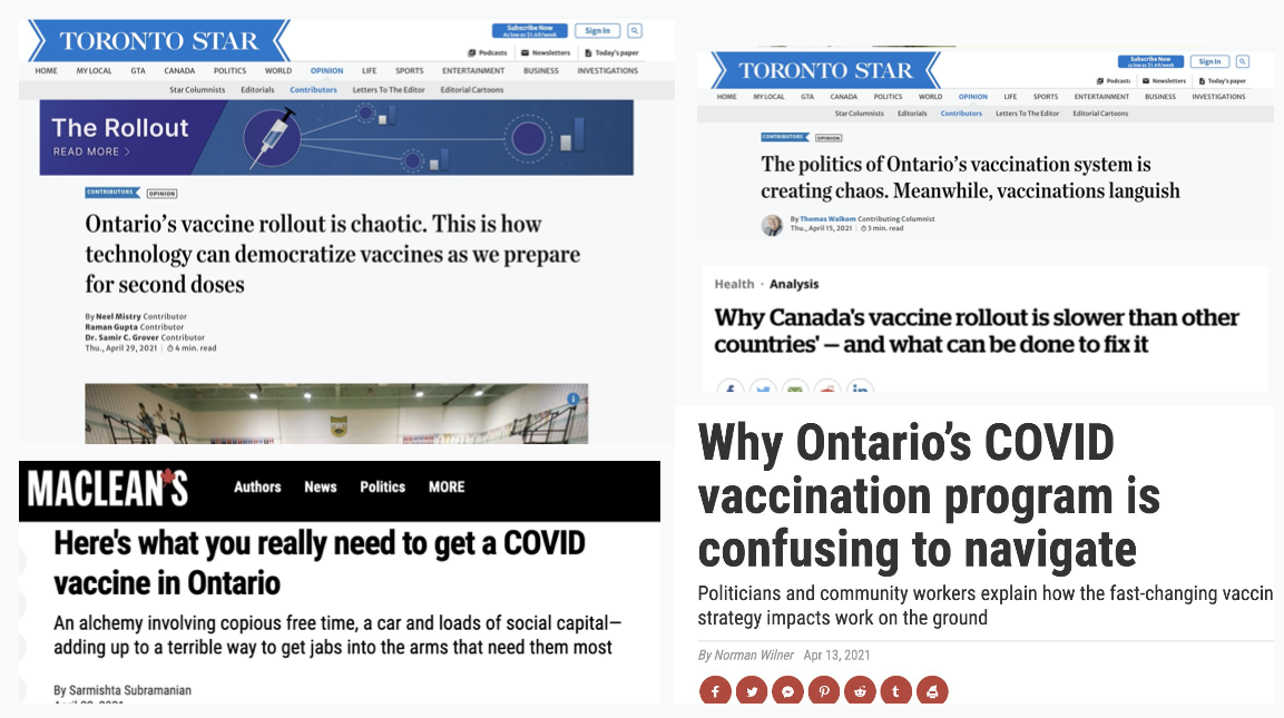
Since the COVID-19 pandemic began and vaccines began to roll-out, booking a COVID-19 vaccine in Ontario has been a challenge for many citizens.
My Role
Collaborated with other UX designers in the Humber UX Design program. Mainly focused on the interface design, style guide and prototyping.
The Opportunity
"How might we create a single COVID-19 vaccine booking experience that allows Ontarians to easily book an appointment"?
Secondary Research
The project began by gathering information on the already existing Ontario COVID-19 vaccine booking system.
We gathered that:
•The current vaccine system is fragmented with bookings for clinics and pharmacies separate.
•Online booking systems can be lengthy, especially when trying to book for multiple people at once.
•The usability of many of the booking systems is challenging for many citizens to book an appointment
User Interviews
Before we began designing our booking system, we sought out to get a better understanding of booking systems and the COVID-19 vaccine via user interviews.
Key Findings:
•Most people booked their appointments on their phone.
•When booking vaccines in the past, most were also booking for a family member as well.
•When searching for a vaccine, users would normally search for the nearest vaccine clinic/pharmacy or the closest available date.
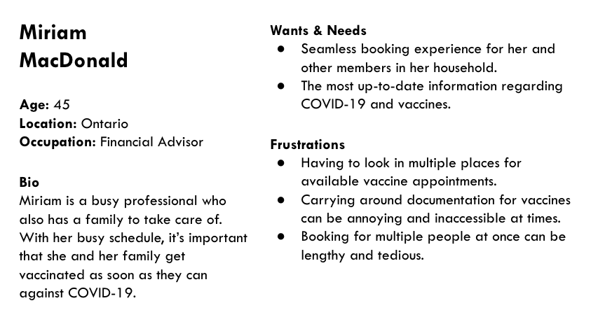
User Personas & Storyboards
After speaking with users, we gained a better understanding of the user we were designing for and summarized that into a user persona:
Sketching the Solution
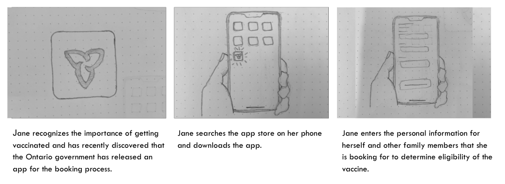
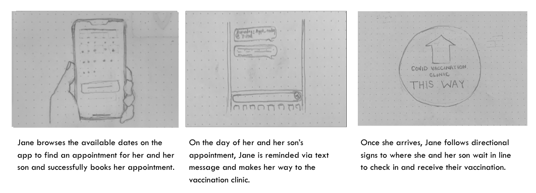
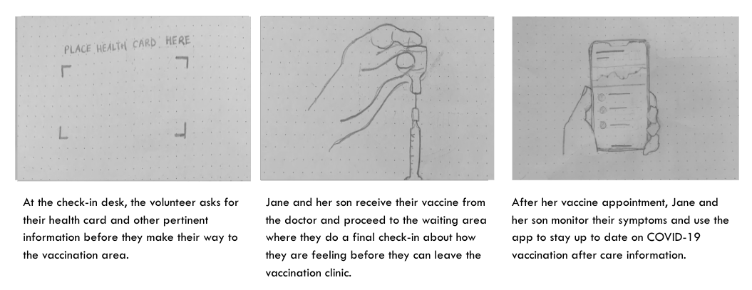
After completing our research, we began with a paper prototype of the app and its flow.
Once we had established a user flow, we then began creating sketches for the flow to create a paper prototype. The paper prototype was then used for usability testing session to inform future iterations of the design,
Screens for paper prototype of app that were subsequently used for usability testing sessions.
Usability Testing
Using our paper prototype, we were able to conduct 4 usability testing sessions. In the usability testing session, users were tasked with:
•Creating an account to book their vaccine.
•Book a vaccine appointment for themselves and their family member.
Key Takeaways:
•Appointment Picker - when picking an appointment, users felt it was annoying they had to go to a previous page if they wanted to change the way they were searching for an appointment (by earliest date or closest vaccination site).
•Booking for a family member - some users expressed that they thought the app would allow them to book their vaccine once theirs was already booked, when in reality it is all done at once sequentially.
•Success states - once a user had successfully created their account or added a family member, they weren't 100% sure if they had done it correctly as the app didn't alert the user they had successfully done so.
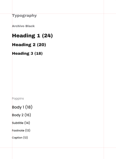
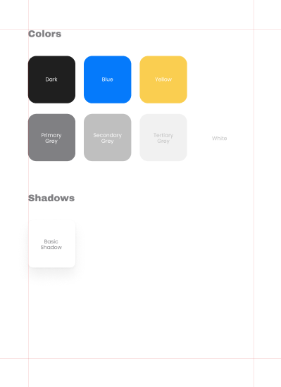
Design System
Before we began designing, the high-fidelity prototype, we settled on a design system to follow to ensure consistency throughout the application.
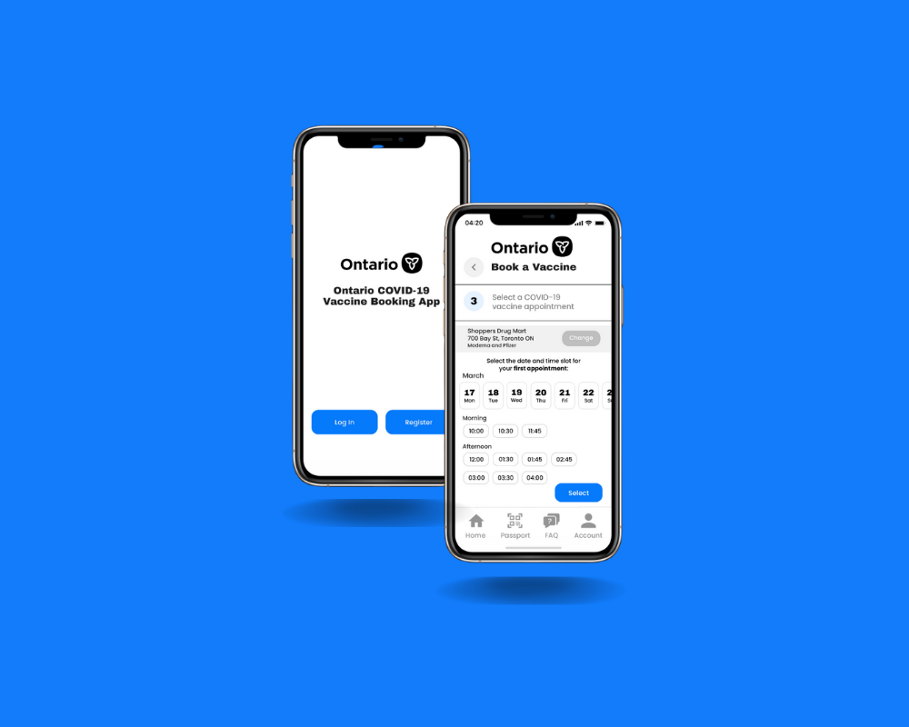
The Final Solution
After we had completed our usability testing, we sought out to make changes that would address the issues that arose during usability testing:
•A segmented control navigation bar was added to the appointment picker screen so users could easily toggle how they wanted to search for appointments.
•More apparent success state was designed to include a bright green check mark to alert the user they have successfully created their account or added a family member.
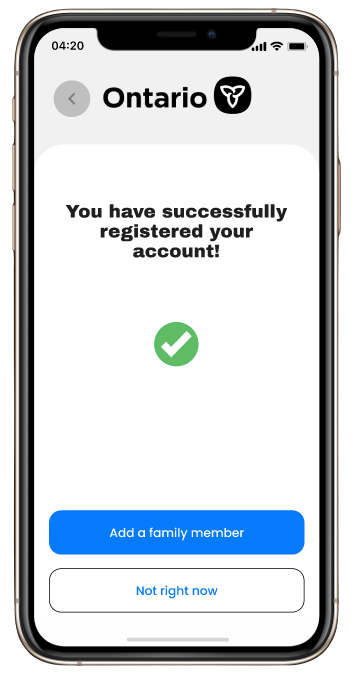
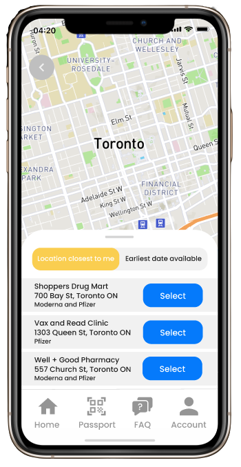
Re-designed success state screen once user has successfully registered their account and re-designed appointment picker with segmented control navigation bar.
Explore the prototype for this project here.